Overview
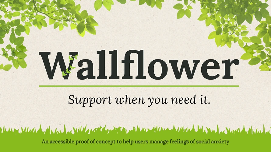
Wallflower is a digital toolkit for anxiety relief, targeting panic recovery, social anxiety, and confidence-building. Mid-project, I stepped up to lead both user research and UI design. By adopting an agile UX cycle and letting go of personal creative attachments, I helped the team pivot from overstimulating minigames to a calm, accessible app—with a 27% reduction in user-reported stress at launch.
🎯 Problem
Our team originally pitched Wallflower as a joyful “toybox” of minigames, puzzles, and playful nature animations to support anxious users. As a game designer, I joined the team excited to build those playful tools.
But early research challenged our assumptions.
Challenge:
Could we rethink Wallflower from a stimulating experience into a truly calming one—without losing appeal or accessibility?
🧭 My Role
Originally brought on for user research, I pivoted into lead UX designer mid-production, taking over both research and UI design responsibilities due to team bandwidth issues.
🔍 Research Process
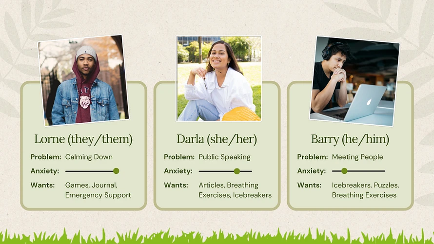
1. Audience Definition
We focused on three high-need contexts:
-
Panic attack recovery
-
Social anxiety in daily life
-
Confidence building
Our user group was primarily college students navigating stress, identity, and emotional overwhelm—especially during high-pressure times like finals.
2. Biweekly UX Testing Loop
To manage scope and ensure quality:
-
I ran one-on-one usability tests every two weeks with ~5 users
-
Synthesized findings into a prioritized UX change proposal
-
Presented to stakeholders for feedback and approval
-
Implemented updates in Figma prototypes for dev hand-off
This became our core agile loop: research → recommend → iterate → build.
3. Emotional Safety Redesign
Early tests revealed that our toybox pitch—while creative—was overstimulating for anxious users. Many reported:
-
Decision fatigue
-
Confusion around navigation
-
Frustration with “cheerful” feedback loops during distress
This was a major turning point for me. As a game designer, I had to kill my darlings—cutting interactive features I loved—in order to respect user needs.
4. Key UX Pivots
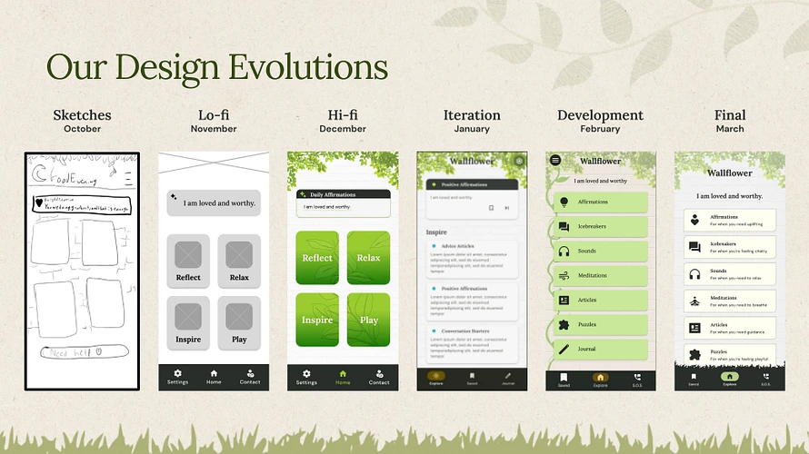
-
Replaced saturated colors and microanimations with flat, neutral visuals
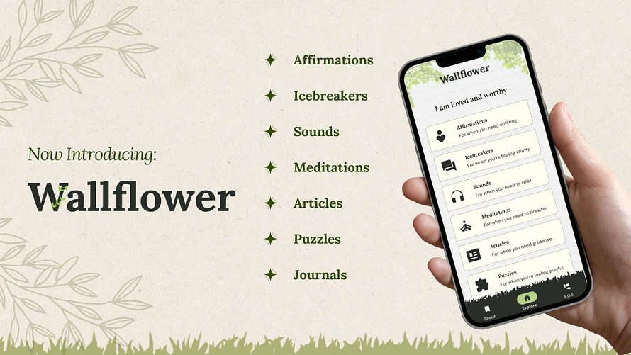
-
Prioritized low-effort content like guided meditations, affirmations, soft sounds, and journaling
-
Simplified flows to support users under high emotional load
-
Introduced emotional valence charts to track user mood across sessions
This was a moment of real growth: I learned to value effectiveness over novelty, and led our team toward calm by letting go of drama.
🧪 Final Validation
I proposed and ran a real-world A/B test to evaluate impact during finals season:
-
Initial survey: All users rated resting anxiety levels
-
Split into test group (with app access) and control group (no app)
-
After two weeks, follow-up survey measured change in anxiety
Results:
-
🎯 Test group reported 27% lower stress levels than control
-
✅ We verified not just usability—but emotional impact
-
🎓 This went above standard student project scope, but we felt it was ethically necessary to validate our work
💡 Outcome
-
Re-scoped Wallflower from toybox to toolkit
-
Designed and validated a calm-centered UX strategy
-
Completed on time despite major mid-project role pivot
-
Delivered a functioning app that measurably helped users cope with anxiety
🛠️ Tools & Skills Demonstrated
-
UX Research & Usability Testing
-
Agile Sprint Planning
-
UI Design & Prototyping (Figma)
-
Accessibility & Cognitive Load Reduction
-
Emotional Valence Mapping
-
A/B Testing & Experimental Design
-
UX Strategy & Scope Pivoting
-
Cross-functional Communication & Management